Prerequisites
This guide assumes you have already integrated ECharts into your project via npm. The official ECharts website offers various chart examples that you can customize as needed.
The final dashboard will look like the following:
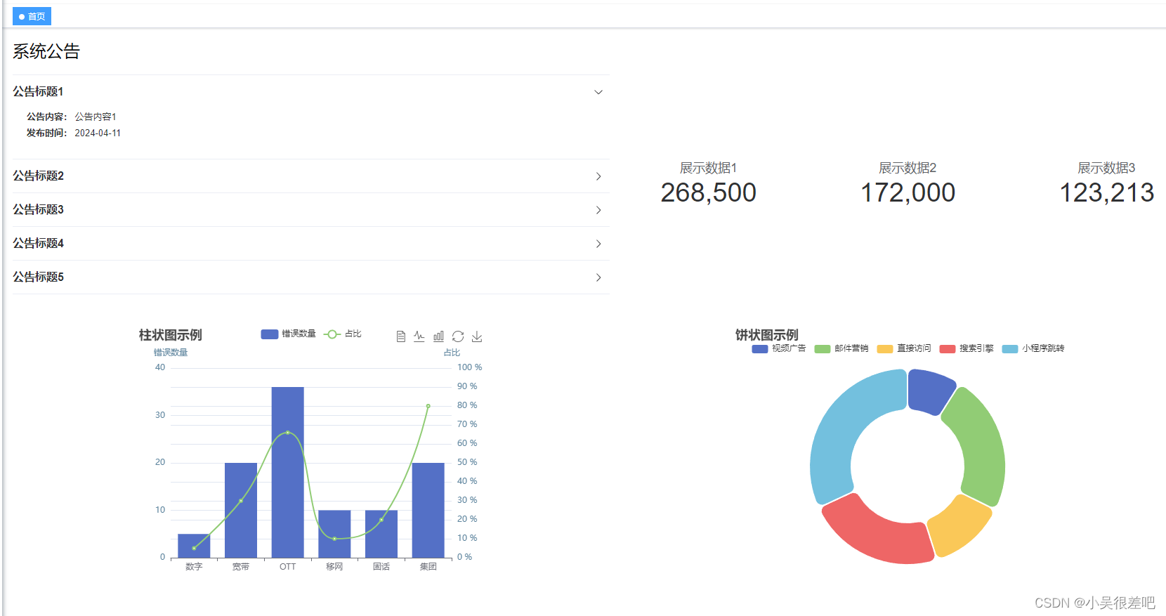
Frontend Implementation
Define a container in the page to display the chart. The interaction between frontend and backend can be summarized (using a combination bar and line chart as an example):
After defining the ECharts instance in the page, the main task is to fetch data from the backend to populate the X and Y axes. Note that the X-axis typically contains fixed categories, while the Y-axis contains numerical values corresponding to each category. If you need to display a single datta series, the backand should return one Y-axis array; for two series, two Y-axis arrays are needed, and so on. Once the data is populated, you can optionally enable other ECharts features. Important code points are commented. The ECharts component is highly customizable; refer to the official documentation for special requirements. This code snippet represents a complete page that can be run directly. If you only need to display the graph, focus on the relevent parts.
<template>
  <div style="margin-left:15px;">
    <h2>System Announcements</h2>
    <el-row style="margin-top: 15px;">
      <el-col :span="12">
        <el-collapse v-model="activeName" accordion>
          <el-collapse-item
            v-for="item in noticeData"
            :key="item.id"
            :title="item.name"
            :name="item.id"
          >
            <div style="padding:0 20px;">
              <strong>Content:</strong>
              {{ item.content }}
            </div>
            <div style="padding:0 20px;">
              <strong>Published:</strong>
              {{ item.pubDate }}
            </div>
          </el-collapse-item>
        </el-collapse>
      </el-col>
      <el-col :span="4" class="statisticStyle">
        <el-statistic title="Metric 1" :value="268500" />
      </el-col>
      <el-col :span="4" class="statisticStyle">
        <el-statistic title="Metric 2" :value="outputValue" />
      </el-col>
      <el-col :span="4" class="statisticStyle">
        <el-statistic title="Metric 3" :value="123213" />
      </el-col>
    </el-row>
    <el-row style="margin-top: 45px;">
      <el-col :span="12" class="statisticStyle">
        <div ref="echartsRef" style="height: 400px; width: 500px">gamePlay</div>
      </el-col>
      <el-col :span="12" class="statisticStyle">
        <div ref="echartsPie" style="height: 400px; width: 500px">echartsPie</div>
      </el-col>
    </el-row>
  </div>
</template>

<script setup>
import { ref, onMounted } from "vue";
import { useTransition } from "@vueuse/core";
import * as echarts from "echarts";
import { getData, getData2 } from "@/api/test/newindex";

const echartsRef = ref();
const echartsPie = ref();
const echartsLine = ref();

const noticeData = [
  { id: 1, name: "Announcement 1", content: "Content 1", pubDate: "2024-04-11" },
  { id: 2, name: "Announcement 2", content: "Content 2", pubDate: "2024-04-11" },
  { id: 3, name: "Announcement 3", content: "Content 3", pubDate: "2024-04-11" },
  { id: 4, name: "Announcement 4", content: "Content 4", pubDate: "2024-04-11" },
  { id: 5, name: "Announcement 5", content: "Content 5", pubDate: "2024-04-11" },
];
const activeName = ref(noticeData.length > 0 ? noticeData[0].id : "");

onMounted(() => {
  initBar();
});

const source = ref(0);
const outputValue = useTransition(source, {
  duration: 1500
});
source.value = 172000;

function initBar() {
  getData().then(res => {
    if (res.code == 200 && res.data != null) {
      getBar(res.data.xAxis, res.data.yAxis, res.data.yAxis2);
    }
  });
  getData2().then(res => {
    if (res.code == 200 && res.data != null) {
      getPie(res.data);
    }
  });
}

function getBar(xAxis, yAxis, yAxis2) {
  const myChart = echarts.init(echartsRef.value);
  const option = {
    title: {
      text: "Bar Chart Example"
    },
    tooltip: {
      trigger: "axis",
      axisPointer: {
        type: "cross",
        crossStyle: {
          color: "#999"
        }
      }
    },
    toolbox: {
      feature: {
        dataView: { show: true, readOnly: false },
        magicType: { show: true, type: ["line", "bar"] },
        restore: { show: true },
        saveAsImage: { show: true }
      }
    },
    legend: {
      data: ["Error Count", "Percentage"]
    },
    xAxis: {
      data: xAxis
    },
    yAxis: [
      {
        type: "value",
        name: "Error Count",
        show: true,
        interval: 10,
        axisLine: {
          lineStyle: {
            color: "#5e859e",
            width: 2
          }
        }
      },
      {
        type: "value",
        name: "Percentage",
        min: 0,
        max: 100,
        interval: 10,
        axisLabel: {
          formatter: "{value} %"
        },
        axisLine: {
          lineStyle: {
            color: "#5e859e",
            width: 2
          }
        }
      }
    ],
    series: [
      {
        name: "Error Count",
        type: "bar",
        data: yAxis
      },
      {
        name: "Percentage",
        type: "line",
        smooth: true,
        yAxisIndex: 1,
        data: yAxis2,
        tooltip: {
          valueFormatter: function(value) {
            return value + " %";
          }
        }
      }
    ]
  };
  myChart.setOption(option);
}

function getLine(xAxis, yAxis) {
  const myChartLine = echarts.init(echartsLine.value);
  const option = {
    title: {
      text: "Line Chart Example"
    },
    tooltip: {},
    legend: {
      data: [
        {
          name: "Error Count",
          icon: "circle",
          textStyle: {
            color: "black"
          }
        }
      ]
    },
    xAxis: {
      data: xAxis
    },
    yAxis: {},
    series: [
      {
        name: "Error Count",
        type: "line",
        data: yAxis
      }
    ]
  };
  myChartLine.setOption(option);
}

function getPie(data) {
  const myChartPie = echarts.init(echartsPie.value);
  const option = {
    title: {
      text: "Pie Chart Example"
    },
    tooltip: {
      trigger: "item"
    },
    radius: ["40%", "70%"],
    legend: {
      top: "5%",
      left: "center"
    },
    series: [
      {
        name: "Access Source",
        type: "pie",
        radius: ["40%", "70%"],
        itemStyle: {
          borderRadius: 10,
          borderColor: "#fff",
          borderWidth: 2
        },
        tooltip: {
          trigger: "item",
          formatter: "{b}:{c}({d}%)"
        },
        label: {
          show: false,
          position: "center"
        },
        emphasis: {
          label: {
            show: true,
            fontSize: 30,
            fontWeight: "bold"
          }
        },
        labelLine: {
          show: false
        },
        data
      }
    ]
  };
  myChartPie.setOption(option);
}
</script>
<style scoped>
.el-statistic {
  --el-statistic-content-font-size: 38px;
  --el-statistic-title-font-size: 18px;
}
.el-collapse-item{
  --el-collapse-header-font-size: 16px;
}
::v-deep .el-collapse-item__header{
  font-weight: 550;
}
.statisticStyle {
  text-align: center;
  display: flex;
  flex-direction: column;
  justify-content: center;
  align-items: center;
  flex-wrap: nowrap;
}
</style>
Backend Implementation
The following backend code demonstrates the interaction with the frontend using simulated data. You can adapt it to your own business logic.
@RestController
@RequestMapping("/echartsData")
public class EchartsDataController {

    @GetMapping("/echarts/chartOne")
    public AjaxResult chartOne(){
        List<String> xAxis = new ArrayList<>();
        List<Integer> yAxis = new ArrayList<>();
        List<Integer> yAxis2 = new ArrayList<>();
        String[] categories = {"Digital", "Broadband", "OTT", "Mobile", "Fixed Line", "Group"};
        xAxis.addAll(Arrays.asList(categories));
        int[] values1 = {5, 20, 36, 10, 10, 20};
        for (int num : values1) {
            yAxis.add(num);
        }
        int[] values2 = {5, 30, 66, 10, 20, 80};
        for (int num : values2) {
            yAxis2.add(num);
        }
        Map<String,Object> map = new HashMap<>();
        map.put("xAxis",xAxis);
        map.put("yAxis",yAxis);
        map.put("yAxis2",yAxis2);
        return AjaxResult.success(map);
    }

    @GetMapping("/echarts/chartTwo")
    public AjaxResult chartTwo(){
        List<PieDto> list = new ArrayList<>();
        list.add(new PieDto("Video Ads",235));
        list.add(new PieDto("Email Marketing",610));
        list.add(new PieDto("Direct Access",335));
        list.add(new PieDto("Search Engine",600));
        list.add(new PieDto("Mini Program",835));
        return AjaxResult.success(list);
    }
}
DTO classes:
@Data
@AllArgsConstructor
public class TestDto {
    private String name;
    private int number;
    private String type;
}

@Data
@AllArgsConstructor
public class PieDto {
    private String name;
    private int value;
}