This lab explores Naive Bayes features by visualizing tweet sentiment data, focusing on the log-likelihood ratio as a numeric feature for machine learning. We also introduce confidence ellipses as a tool to intuitively represent the Naive Bayes model.
Imports
import numpy as np
import pandas as pd
import matplotlib.pyplot as plt
from utils import confidence_ellipse
Calculate Likelihoods for Each Tweet
For each tweet, we compute its positive and negative likelihoods. The log-likelihood ratio is defined as:
$$ \log \frac{P(\text{tweet}|\text{pos})}{P(\text{tweet}|\text{neg})} = \log(P(\text{tweet}|\text{pos})) - \log(P(\text{tweet}|\text{neg})) $$
Where:
$$ \text{positive} = \log(P(\text{tweet}|\text{pos})) = \sum_{i=0}^{n} \log P(W_i|\text{pos}) $$
$$ \text{negative} = \log(P(\text{tweet}|\text{neg})) = \sum_{i=0}^{n} \log P(W_i|\text{neg}) $$
The code for these calculations is not required in this lab, but the results are provided in the file bayes_features.csv.
data = pd.read_csv('./data/bayes_features.csv')
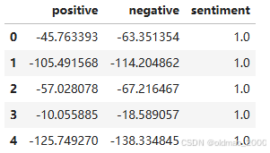
data.head(5)
fig, ax = plt.subplots(figsize=(8, 8))
colors = ['red', 'green']
sentiments = ['negative', 'positive']
index = data.index

for sentiment in data.sentiment.unique():
    ix = index[data.sentiment == sentiment]
    ax.scatter(data.iloc[ix].positive, data.iloc[ix].negative, c=colors[int(sentiment)], s=0.1, marker='*', label=sentiments[int(sentiment)])

ax.legend(loc='best')
plt.xlim(-250, 0)
plt.ylim(-250, 0)
plt.xlabel('Positive')
plt.ylabel('Negative')
plt.show()
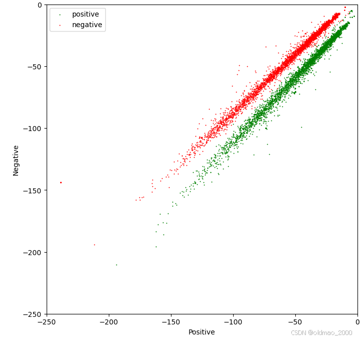
Using Confidence Ellipses to Interpret Naive Bayes
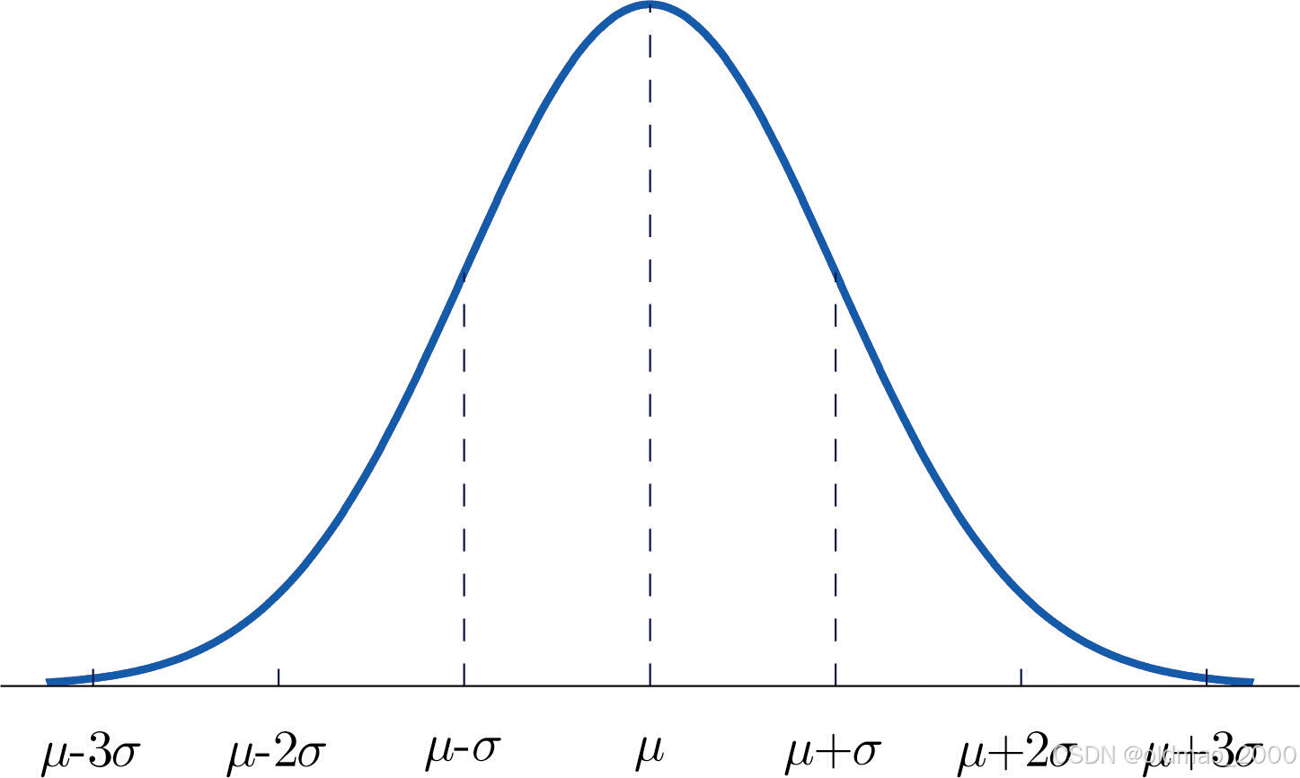
Confidence ellipses are a way to visualize two-dimensional random variables. They are particularly useful for large datasets where points heavily overlap, obscuring the true distribution. An ellipse summarizes the data with just four parameters:
- Center: The mean of the attributes.
- Height and width: Related to the variance of each attribute. The user specifies the number of standard deviations (n_std) for the ellipse boundayr.
- Angle: Related to the covariance between attributes.
For a normal distribution:
- About 68% of the area under the curve lies within 1 standard deviation of the mean.
- About 95% lies within 2 standard deviations.
- About 99.7% lies within 3 standard deviations.
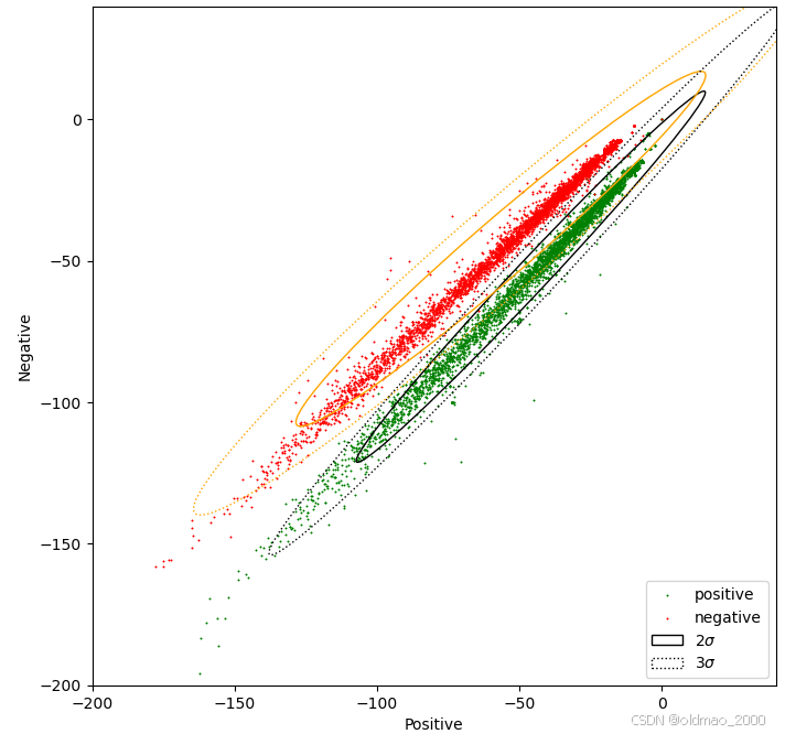
fig, ax = plt.subplots(figsize=(8, 8))
colors = ['red', 'green']
sentiments = ['negative', 'positive']
index = data.index

for sentiment in data.sentiment.unique():
    ix = index[data.sentiment == sentiment]
    ax.scatter(data.iloc[ix].positive, data.iloc[ix].negative, c=colors[int(sentiment)], s=0.1, marker='*', label=sentiments[int(sentiment)])

plt.xlim(-200, 40)
plt.ylim(-200, 40)
plt.xlabel('Positive')
plt.ylabel('Negative')

data_pos = data[data.sentiment == 1]
data_neg = data[data.sentiment == 0]

confidence_ellipse(data_pos.positive, data_pos.negative, ax, n_std=2, edgecolor='black', label=r'$2\sigma$')
confidence_ellipse(data_neg.positive, data_neg.negative, ax, n_std=2, edgecolor='orange')
confidence_ellipse(data_pos.positive, data_pos.negative, ax, n_std=3, edgecolor='black', linestyle=':', label=r'$3\sigma$')
confidence_ellipse(data_neg.positive, data_neg.negative, ax, n_std=3, edgecolor='orange', linestyle=':')
ax.legend(loc='lower right')
plt.show()
Now, modify the positive tweet features to make them overlap with the negative ones:
data2 = data.copy()

# Modify the negative attribute for sentiment == 1
data2.loc[data2.sentiment == 1, 'negative'] = data2.loc[data2.sentiment == 1, 'negative'] * 1.5 + 50

# Modify the positive attribute for sentiment == 1
data2.loc[data2.sentiment == 1, 'positive'] = data2.loc[data2.sentiment == 1, 'positive'] / 1.5 - 50
Plot the modified data:
fig, ax = plt.subplots(figsize=(8, 8))
colors = ['red', 'green']
sentiments = ['negative', 'positive']
index = data2.index

for sentiment in data2.sentiment.unique():
    ix = index[data2.sentiment == sentiment]
    ax.scatter(data2.iloc[ix].positive, data2.iloc[ix].negative, c=colors[int(sentiment)], s=0.1, marker='*', label=sentiments[int(sentiment)])

plt.xlim(-200, 40)
plt.ylim(-200, 40)
plt.xlabel('Positive')
plt.ylabel('Negative')

data_pos = data2[data2.sentiment == 1]
data_neg = data[data2.sentiment == 0]

confidence_ellipse(data_pos.positive, data_pos.negative, ax, n_std=2, edgecolor='black', label=r'$2\sigma$')
confidence_ellipse(data_neg.positive, data_neg.negative, ax, n_std=2, edgecolor='orange')
confidence_ellipse(data_pos.positive, data_pos.negative, ax, n_std=3, edgecolor='black', linestyle=':', label=r'$3\sigma$')
confidence_ellipse(data_neg.positive, data_neg.negative, ax, n_std=3, edgecolor='orange', linestyle=':')
ax.legend(loc='lower right')
plt.show()
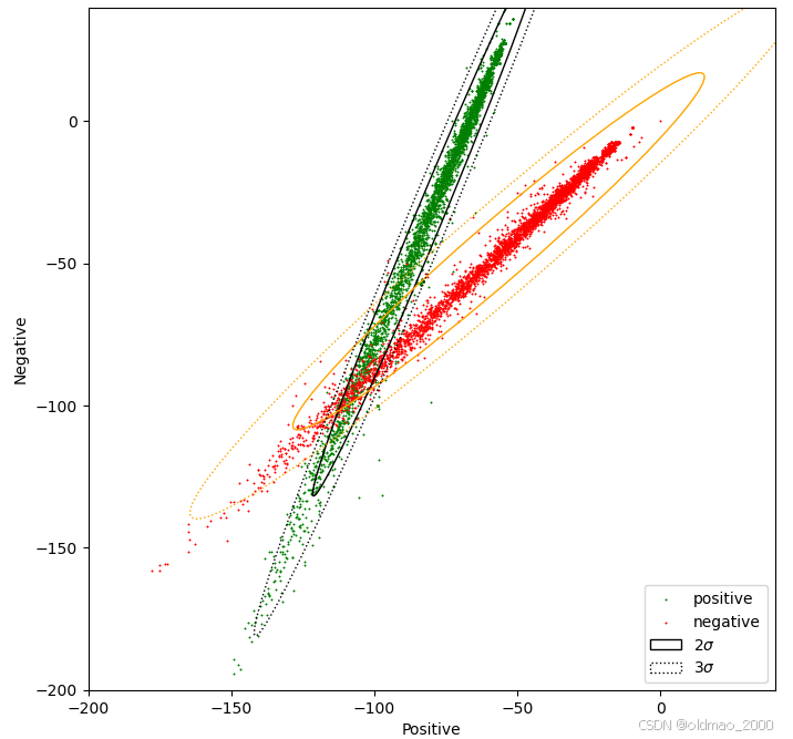
After the modification, the distributions of positive and negative tweets begin to overlap, illustrating how changes in features affect model separability.